


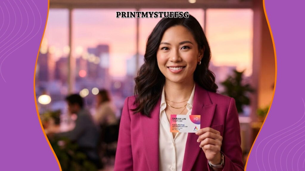
You hand someone your name card.
They glance at it for three seconds.
Before you’ve even started introducing yourself, they’ve already formed an opinion about your business.
Is this company professional?
Can they be trusted?
Do they pay attention to details?
Are they established or just starting out?
Should I keep this card—or throw it away later?
Your name card speaks long before you do. Every design choice, material, font, and piece of information silently communicates something about your brand. The question is: what is your name card actually saying?
Despite the rise of digital networking, name cards remain one of the most powerful first-impression tools in business. They aren’t simply a way to exchange contact information—they’re physical representations of your brand identity.
A poorly designed name card can unintentionally communicate unprofessionalism, inconsistency, or lack of attention to detail. A thoughtfully designed one builds trust, reinforces your brand, and makes people more likely to remember you.
This guide explains:
- What a name card communicates
- Why design matters more than many business owners realise
- Common mistakes that weaken first impressions
- How to create a name card that supports your business goals
- Frequently asked questions about professional business cards
Whether you’re launching a new business or redesigning your branding, understanding the psychology behind name cards can help you make a stronger impression.
What Is a Name Card?
A name card, also known as a business card, is a compact marketing tool that contains your professional identity and contact information.
However, modern branding views it as much more than a contact card.
A name card acts as a miniature brand experience that instantly communicates:
- Professionalism
- Industry positioning
- Brand personality
- Attention to detail
- Business credibility
- Quality expectations
In many networking situations, your name card becomes the only physical reminder someone keeps after meeting you.
That means every design decision influences how people remember your business.
Why Does Your Name Card Matter?
People naturally make quick judgments.
Studies on first impressions consistently show that humans evaluate credibility, competence, and professionalism within seconds of encountering someone—or their brand materials.
Your name card becomes part of that evaluation.
Instead of asking:
“Does my name card look nice?”
Ask:
“What assumptions will people make after seeing it?”
Those assumptions directly influence whether people:
Save your contact
Visit your website
Recommend your business
Request a quotation
Remember your company later
Your card is often your silent salesperson.
Benefits of a Well-Designed Name Card
1. Creates a Strong First Impression
Your card often represents your brand before future conversations happen.
A clean, organised design suggests:
- Professionalism
- Reliability
- Experience
- Confidence
Meanwhile, cluttered or outdated designs may unintentionally communicate the opposite.
2. Builds Trust
Trust is built through consistency.
If your website, logo, social media, packaging, and name card all share a consistent visual identity, customers feel your business is established and dependable.
Consistency reduces uncertainty.
3. Reinforces Brand Identity
Every visual choice tells a story.
Examples include:
Minimalist Design
Communicates:
- Premium
- Modern
- Elegant
- Professional
Bold Colours
Communicates:
- Energy
- Creativity
- Confidence
Soft Neutral Colours
Communicates:
- Luxury
- Calmness
- Sophistication
High-Quality Paper
Communicates:
- Premium service
- Attention to detail
- Investment in quality
Cheap Thin Card
May unintentionally suggest:
- Cost-cutting
- Temporary business
- Lower perceived value
Material matters just as much as graphics.
4. Makes Your Business Memorable
People receive many business cards.
Most are forgotten.
A distinctive yet practical design improves recall.
Examples include:
- Unique finishing
- Premium textures
- Spot UV
- Foil stamping
- Rounded corners
- Thoughtful typography
The goal isn’t to be flashy.
It’s to be memorable for the right reasons.
5. Encourages Future Contact
A confusing card creates friction.
People shouldn’t struggle to find:
- Phone number
- Website
- Social media
- QR code
The easier your card is to use, the higher the chance someone contacts you later.
6. Supports Your Sales Process
A name card works long after the meeting ends.
It can:
- Generate referrals
- Encourage website visits
- Lead customers to WhatsApp
- Connect people to your portfolio
- Drive appointment bookings
Done well, it’s a compact marketing asset—not just stationery.
What Is Your Name Card Saying?
Ask yourself honestly.
“We don’t pay attention to details.”
Signs include:
- Misaligned elements
- Poor printing
- Blurry logo
- Uneven spacing
- Low-resolution graphics
“We’re difficult to contact.”
Missing:
- Website
- QR code
- Social media
- Business address (where appropriate)
“We tried to fit everything.”
Too much information creates overwhelm.
Instead of communicating expertise, clutter often creates confusion.
“We’re outdated.”
Outdated fonts.
Old branding.
Low-quality images.
Old-fashioned layouts.
These can unintentionally make the business appear inactive.
“We’re confident.”
A confident card doesn’t need excessive decoration.
It communicates clearly.
Leaves breathing room.
Prioritises readability.
Reflects brand consistency.
Examples Across Different Industries
Financial Consultant
Should communicate:
- Trust
- Stability
- Professionalism
Typically uses:
- Clean layouts
- Neutral colours
- Premium paper
- Elegant typography
Creative Agency
Should communicate:
- Innovation
- Creativity
- Original thinking
May use:
- Bold layouts
- Unique typography
- Creative finishes
- Unexpected colours
Restaurant Owner
May focus on:
- Warmth
- Hospitality
- Local identity
Could include:
- QR code to menu
- Reservation contact
- Brand colours
Property Agent
Should prioritise:
- Professional photo (where appropriate)
- Easy contact methods
- Clean branding
- Readability
Trust is often more important than decoration.
Luxury Brand
Everything should communicate exclusivity.
Often through:
- Minimalism
- Thick paper stock
- Foil stamping
- Embossing
- Soft-touch finishes
Luxury is often communicated through restraint rather than excess.
Best Practices for Designing a Professional Name Card
Prioritise Readability
People should find important information immediately.
Use High-Resolution Logos
Avoid pixelated artwork.
Professional printing deserves professional files.
Include Only Essential Information
Typically:
- Name
- Position
- Company
- Phone
- Website
- QR code (optional)
Less is often more.
Match Your Brand Identity
Your card should visually match:
- Website
- Social media
- Brochures
- Packaging
- Signage
Consistency strengthens recognition.
Choose Quality Printing
Printing quality affects perceived business quality.
Consider finishes such as:
- Matte lamination
- Spot UV
- Foil stamping
Choose finishes that support your brand rather than simply adding decoration.
Frequently Asked Questions (FAQ)
What information should a business name card include?
A professional name card usually includes your name, job title, company name, phone number, email address, website, and company logo. Depending on your industry, a QR code linking to your portfolio, booking page, or digital contact card can also improve convenience.
Does a business card still matter in the digital age?
Yes. While digital networking has become more common, physical name cards continue to make strong first impressions during meetings, networking events, exhibitions, conferences, and client visits. They provide a tangible reminder of your business after the conversation ends.
What is the best material for a professional name card?
There is no single “best” material. The right choice depends on your brand positioning. Premium paper stocks, matte finishes, textured cardstock, soft-touch lamination, and foil accents can all enhance perceived quality when used appropriately.
Should I include a QR code on my business card?
A QR code can improve convenience by directing people to your website, digital portfolio, LinkedIn profile, online catalogue, appointment booking page, or contact information. Ensure it complements the design rather than dominating it.
How often should I redesign my business card?
Review your name card whenever your branding changes, your contact information is updated, or the design begins to feel inconsistent with your current business identity. Even without major changes, evaluating it every few years helps keep your branding current.
Is a simple business card better than a colourful one?
Neither approach is universally better. The design should reflect your brand personality and industry expectations. Professional services often benefit from clean, understated layouts, while creative industries may successfully use bold colours and distinctive typography.
What are the most common business card design mistakes?
Common mistakes include overcrowding the layout, using hard-to-read fonts, printing low-resolution logos, inconsistent branding, poor colour contrast, outdated contact information, and selecting materials that don’t align with your brand positioning.
Conclusion
Your name card is far more than a piece of printed paper.
It’s often the first physical experience someone has with your brand, quietly shaping perceptions before a single conversation begins. Every design decision—from typography and layout to paper quality and finishing—communicates something about your professionalism, attention to detail, and the value people can expect from your business.
The most effective name cards don’t try to say everything. They say the right things, clearly and confidently. By focusing on readability, consistent branding, quality materials, and thoughtful design, you create a card that not only shares your contact details but also reinforces trust and leaves a lasting impression.